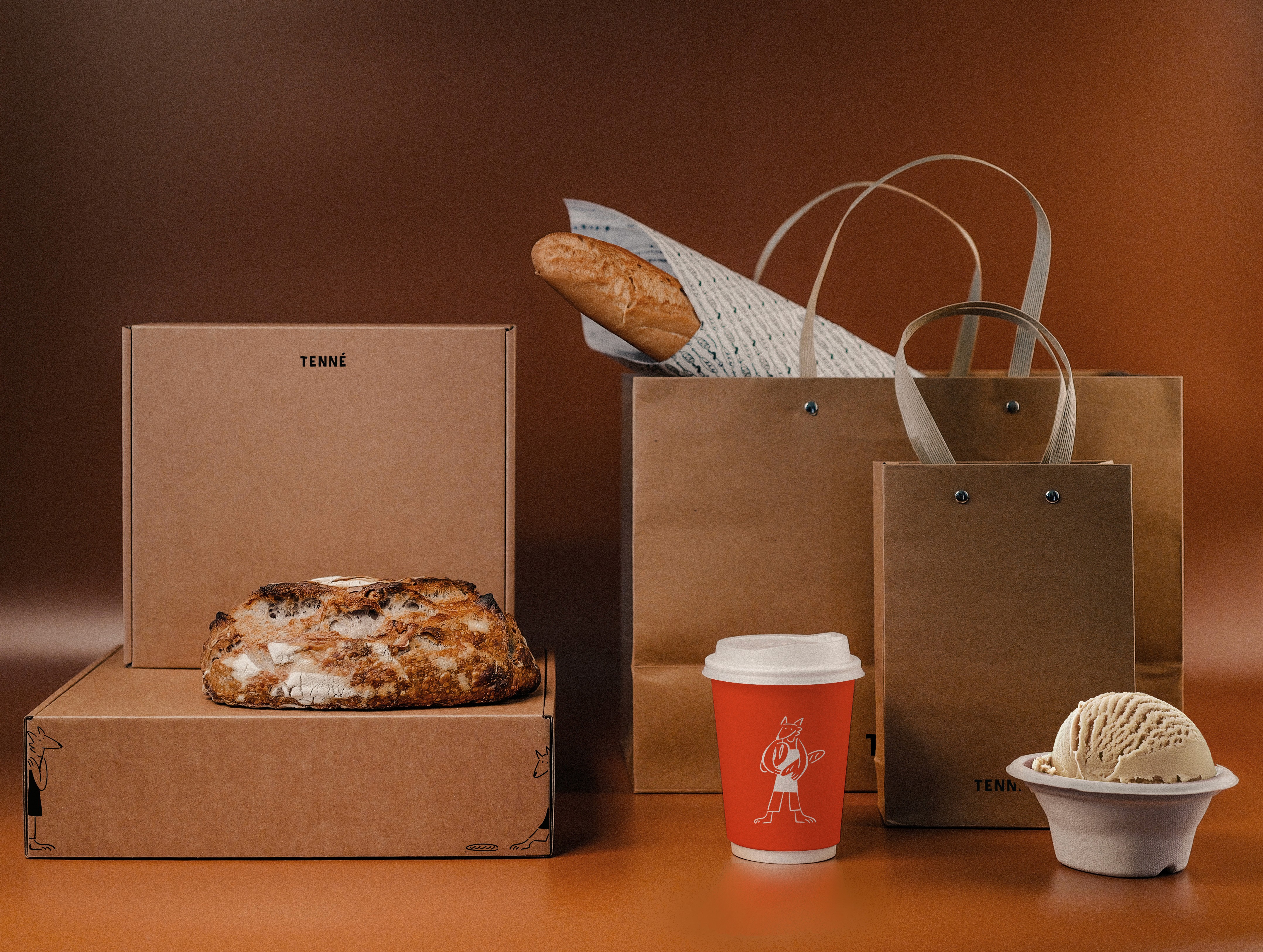
Project Description
In an era where every bakery claims “quality,” “taste,” and “ambience,” TIN explored a quieter path. How can a brand connect—not by saying more, but by clearing space? Tenné emerged as a brand built on the aesthetics of emptiness. From space to identity to communication, the project was an exercise in restraint—designing a brand that doesn’t shout, but lingers. At its core was Tenné—a fictional, unseen character who protects warmth, bread, and love, only ever present through whispers.
How can a brand hold presence in silence?
TIN approached the project not as a bakery brand, but as an immersive emotional ecosystem. The challenge wasn’t to decorate, but to subtract—to allow the audience to find the brand, rather than be shown it. The question became: Could simplicity, consistency, and sensory quietness be the loudest statement?
TIN defined its own theory—Quiet Branding—where design, space, and story harmonize without noise. From spatial layout to tone of voice, every choice was made to preserve clarity and calm. Illustrations of Tenné were hidden throughout the space, inviting customers to discover the brand’s world rather than be told it. Nothing was forced, everything was felt. A brand not seen first—but sensed. In a market of noise, Tenné is a brand that breathes.
What We Did
Brand Identity, Brand Strategy, Art Direction, Copywriting, Packaging, Digital Strategy, Signage Design, Uniform & Merchandise Design, Printed Matter, Social Media Content, Campaign Design, Photography Direction